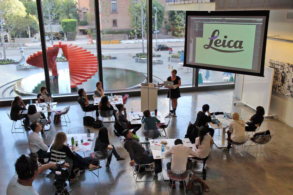
AIGA Orange County is partnering up with TypeEd and Wayfare to bring you Scriptology, a class dedicated to teaching the anatomy of script typefaces on Saturday, March 26. Did you know that most brand marks are script based? Attendees will be able to apply their skills to identify, manipulate, and build script logo marks.
This interview was written by Elissa Dunn and was originally was published by Adobe.com on June 22, 2015. You can read the original article, here.
 Michael is the lead instructor at TypeEd and creative director at Ramp Creative. He lectures on the topics of typography and graphic design at Santa Monica College, the University of Southern California (USC) and College of the Canyons in Valencia. He had a few things to say about the current popularity of hand-lettering, carpenter’s pencils, and the state of type skills in the design industry:
What is TypeEd and how did it all start?
We started TypeEd to bridge the gap of typography knowledge needed between design school and professional practice. While reviewing design portfolios in the studio, we noticed that type skills were declining at a fast rate. It would be impossible for students to compete for available jobs, or even internships, based on the work we were seeing; we couldn’t hire freelancers with the lack of type skills they were presenting.
I learned typography, exhaustively, through the old phototypesetting process during my annual report design years, so copy-fitting planning became part of my design process early on. Currently, typography is not being taught in school or the workplace with the same mindset. So, we started the TypeEd program to instill this mindset and address lacking type skills, make better designers, and to stop the insurgence of type crimes.
What do you think is behind the revival of hand-lettering?
Hand-lettering is definitely experiencing a renaissance. I think, when the design process moved to the computer, designers felt the need to balance their lives by working with their hands. Hence, a resurgence in craftivism and maker culture. After a robotic day of responding to emails and moving mouse around, working with our hands puts us back in touch with our senses. Working with physical tools helps to ground us. And hand-lettering reminds us, in process and in final imperfect form, that we’re still human.
Is there anything in particular that’s inspiring the TypeEd team right now in the design world?
We’re always inspired by craftsmanship and design thinking. Strong ideas that are executed with a skilled hand, right down to the last detail particularly excite us. And always, drop-dead gorgeous typesetting. That said, magazines like Worth, Fast Company, and GQ have always inspired me, personally; I look forward to each new issue and am always looking for beautiful examples of editorial design to share with my students.
What are your favorite design tools? Anything new you’re trying out?
Lately in the office we’ve been using carpenter’s pencils from Home Depot; these cheap pencils with angled nibs help us to quickly sketch letterforms for ideas. Moleskine’s Squared Notebooks are a mainstay, as the grid rules our world and keep us on track. Software-wise, we default to using Adobe InDesign CC’s Info Palette, to help us measure column widths in picas and check character counts of line lengths to ultimately calculate type sizes. And Adobe Illustrator CC’s Smooth Tool has been particularly helpful for vectorizing customized wordmarks.
What can everyone expect from the Scriptology class you’ll be teaching?
The workshop is a beginning, hands-on session that outlines the anatomy and mechanics of script typefaces and demonstrates to attendees how to digitally letter new ones. Script typefaces evolved from cursive handwriting and calligraphy, so their use adds a human and handmade voice to visuals. Designers will learn about how to choose single weight versus variable stroke weight faces, and effectively alter stress, change x-height for readability, and customize letterforms consistently across a whole word mark. Script wordmarks also take into play the concept of the personality.
Attendees working in graphic, apparel, environmental, product and related design fields will all benefit from taking this workshop. Basically anyone who needs to solve a typographic challenge that requires script typefaces or is interested in how to customize script faces for logomark use.
Designers will learn that modifying script letterforms involves the understanding of how differently classic and contemporary script typefaces can communicate the warmth and personality of a name. There are a lot of little decisions a designer has to make: how the mark will be seen, how large or small it is, and on what substrate it will be (a shoe box on the shelf, a neon sign on a busy street or an apparel tag on the bottom of a T-shirt). We’ll touch on the delicate balance of how thin or heavy strokes need to be as well as the spacing around them to make sure the script mark is ultimately successful.
———
Bring your desire to learn and love for type. Scriptology is a hands-on workshop (although laptops are required). Registrants prior to February 14 will receive Script Lettering from Design’s Golden Age upon arrival at the event. Learn more and reserve your spot.