|
|

A solid understanding of the mechanics of printing and the creative options available to you may give you a competitive advantage over your peers and will certainly allow you to be of greater value to your clients. That’s the premise of the latest set of lessons from art director Yee-Ping Cho, who leads the TypeEd session, Pressed For Type.
Yee-Ping has produced annual reports and collateral for Fortune 500 clients, sales and marketing materials for financial advisors, and participated in the American Funds’ rebranding effort lead by the team at Landor and can be found in the permanent collection in the United States Library of Congress. He has a good understanding of what it takes to make work look good in print, so we asked him about the value of print knowledge in the digital world.
Where and how did you learn print production?I was introduced to the world of print production when I took a class at school in which I had to produce my first mechanical, shoot it on a process camera, develop my own negatives in the dark room, strip my own flat and burn my own plates. That experience primed the pump for my first big design opportunity upon graduation in which I worked for Jim Cross and the team at Cross Associates. Traditionally, paper had been marketed to printers, but it was Jim and our client Simpson Paper (subsequently Fox River and now Neenah) who made the smart decision to focus their efforts on the design audience, because they were the ones who specified the papers that printers would ultimately purchase. In that respect, we were pioneers.
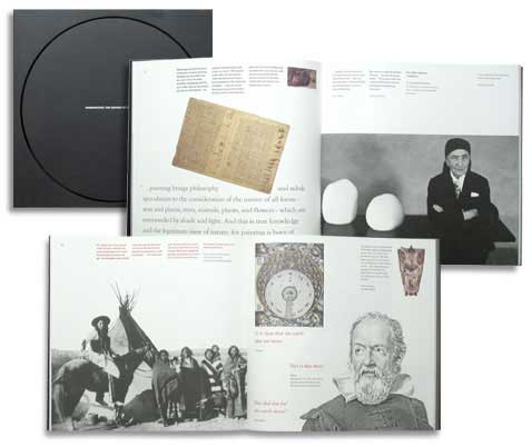
Our job was to design and produce innovative and engaging print pieces to support Simpson’s marketing efforts by showcasing their premium, uncoated text and cover sheets Teton, Filare and Gainsborough. We explored and developed options for embossing, die cutting, foil stamping, touch plates and other in- and off-line techniques by working with amazing printers like Lithographix, George Rice and Anderson Litho, all of whom were absolutely complicit in our efforts to do great work. We had our share of “learning opportunities” along the way, and each one of them shaped my design process to this day.
Does the way that ink lays on the paper affect readability?
Definitely. The way ink lays on the sheet — or not — all have impact on legibility. The great designers understand how to control all of the variables in their workflow including their choice of materials and processes to optimize their results.
Why is it important to understand printing and production techniques in the digital era?
It’s absolutely vital for today’s designer to understand the technical needs of print vs. digital because many of our assets are repurposed for multiple channels. The less experienced designers have great creative chops but they only know how to produce their work in the context of a digital printer, consequently limiting their options for bringing a design to market.
What is the most surprising thing that happened to you on press?
We were running a job in which I had specified to my retoucher that the photos were to be run as black only. (Our goal was to avoid color shifts on press that can happen when monochromatic images are run in process colors.) He provided the assets to our printer who ripped the proofs and all looked good — but we were viewing composed color, not old-school color keys. This was during the period of transition where the industry was moving from analog to digital.
When we were on press, the images looked great but they weren’t behaving like halftones — whenever I’d make a move on the black, the image didn’t respond as expected. We put a loupe on the sheet and also had them pull progressive proofs that revealed that the images were being printed in four colors — exactly what we didn’t want!
The job had to be pulled off press (expensive) and we had to go back up-stream to identify the problem. Turns out Photoshop had converted the images to a four-color default formula rather than a single-channel black. We made the correction, pulled new plates and got on press later in the day to finish the job. Moral of the story — don’t assume anything, have a good proofing checklist for when you do, and work with a printer who is your advocate.
Photo credits: Profile photo of Yee-Ping Cho, Baker Brand; Photo of Simpson Papers promotion, YPC Design.
|
By aigaoc
Published October 8, 2015
|
|